

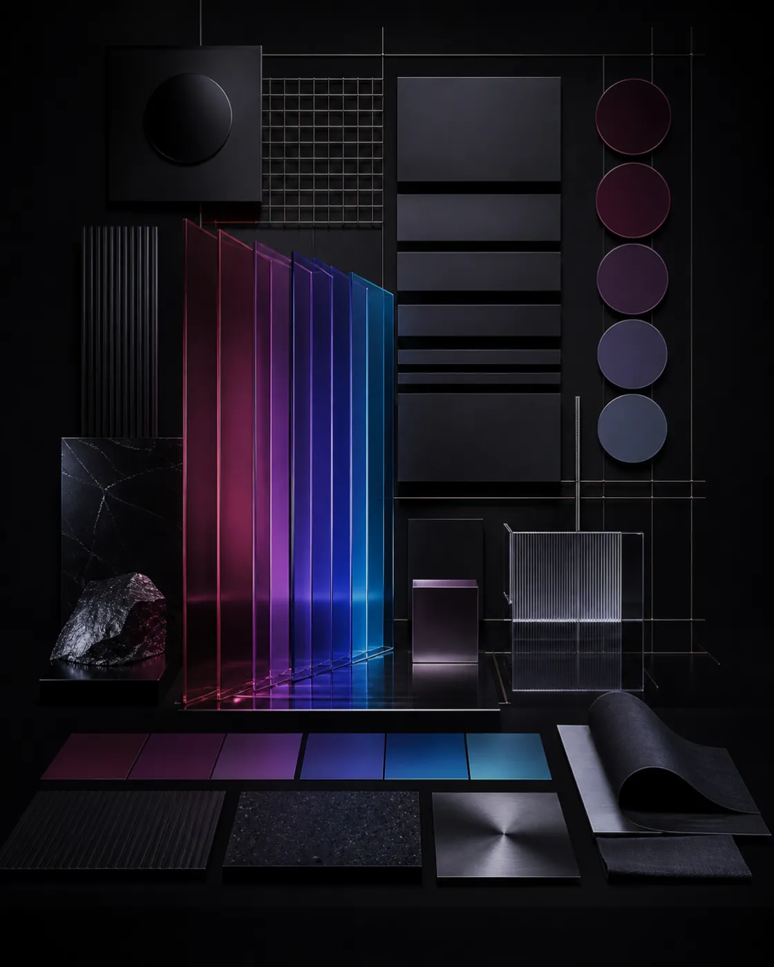
Brand identity and visual guidelines
A brand identity is not a document that sleeps in a folder. It is what lets different vendors produce supports that seem to come from the same company.
- Expertise
- Web & visibility
- Deliverable
- Guidelines document · source files
- Contents
- Palette · type · rules · applications
- Extension
- Digital design system on request
- Base
- France
What a brand identity is for
Without guidelines, every support is a negotiation. The flyer does not look like the site, the sign does not have the same colour as the card, and each new vendor reinvents an approximate identity from what they find.
With guidelines, you hand over a frame. The printer knows the Pantone references, the developer knows the hex codes, the advertising agency knows the margins around the logo. The result is coherent without you having to arbitrate every time.
It is also what makes a brand recognisable before it is even read: a colour, a typeface, and a layout rhythm are enough, if you hold to them.
What we build
- 01
The colour palette
A main colour, secondaries, neutrals, and the functional states a site needs — success, warning, error. Each tint is declined for screen and print, and checked for contrast: a colour that makes text unreadable cannot serve as a text colour, however beautiful it is.
- 02
Type
A display face, a text face, optionally a monospace for data. The choice is made on verifiable criteria: readability at small sizes, richness of weights, availability of needed characters, a web licence actually compatible with your use.
- 03
The rules
Logo clear space, minimum sizes, grid and margins, heading hierarchy, image treatment, forbidden uses. Those rules, more than the colours, are what make an identity hold over time.
- 04
Applications
Stationery, signage, sales supports, publication templates, email models, social dressing. We produce the models actually used in your activity — not a theoretical list.
From guidelines to a design system
On a digital product, printed guidelines are no longer enough: the rules must exist in the code.
- Design tokens — colours, spacing, type, radii — defined once and consumed everywhere.
- A library of coherent components: buttons, fields, cards, tables, loading and error states.
- Light and dark modes treated from design, not added after the fact.
- Contrast checked at WCAG AA, which is also a growing obligation.
- Documentation readable by your developers as by your designers.
What we get asked most
The answers we give anyway at the first conversation.
Do you need a logo before brand guidelines?
That is the simplest order, because palette and type often follow from the logo. But the two can be designed together, and that is even preferable when founding a company or doing a full rebuild.
How long is a brand identity document?
It depends on how many supports must be scoped. A useful identity for a small company holds in a compact document; an identity deployed across dozens of supports needs more. The criterion is not volume, it is that a third party can apply it without calling you.
Can I create a typeface unique to my brand?
Yes, it is possible and it becomes an exclusive asset. It is long work, reserved for brands that deploy their identity widely. In most cases, a rigorous selection among existing fonts gives a more solid result for a cost that is not comparable.
Can an existing identity be taken over?
Yes. We audit what exists, keep what works, and complete what is missing — most often: digital uses, contrast, and interface states, absent from guidelines designed for print.
What often comes with it
Sites, search, and identity: what makes an activity visible and credible online.
- Web & visibilityLogo designLogo design and rebuilds. A vector mark declined for every use, designed to stay readable at favicon size as on a facade.
- Web & visibilityWebsite designCustom website design and development: fast, accessible, and built for search. Brochure, editorial, or commerce — from the problem to launch, in France.
- Web & visibilityEmail campaignsResponsive email campaigns, compatible with every mail client and GDPR-compliant. Newsletters and follow-ups: design, send, and measurement.
- Product & softwareInteractive experiencesInteractive experiences: real-time 3D scenes, WebGL, and custom configurators. Built to stay smooth on the actual web, not only in a demo.



An identity to set or to straighten?
Show us your current supports. We tell you what holds and what must be taken over.
Request a quote Reply on business days · contact@anym.fr